2026 | Professional
Hisun pharmaceutical Packaging Planning and Design
Entrant
Beijing Upimages brand design company + Guo Xiaowei/Zhejiang Hisun pharmaceutical co.,ltd
Category
Packaging Design - Pharmaceutical
Client's Name
Country / Region
China
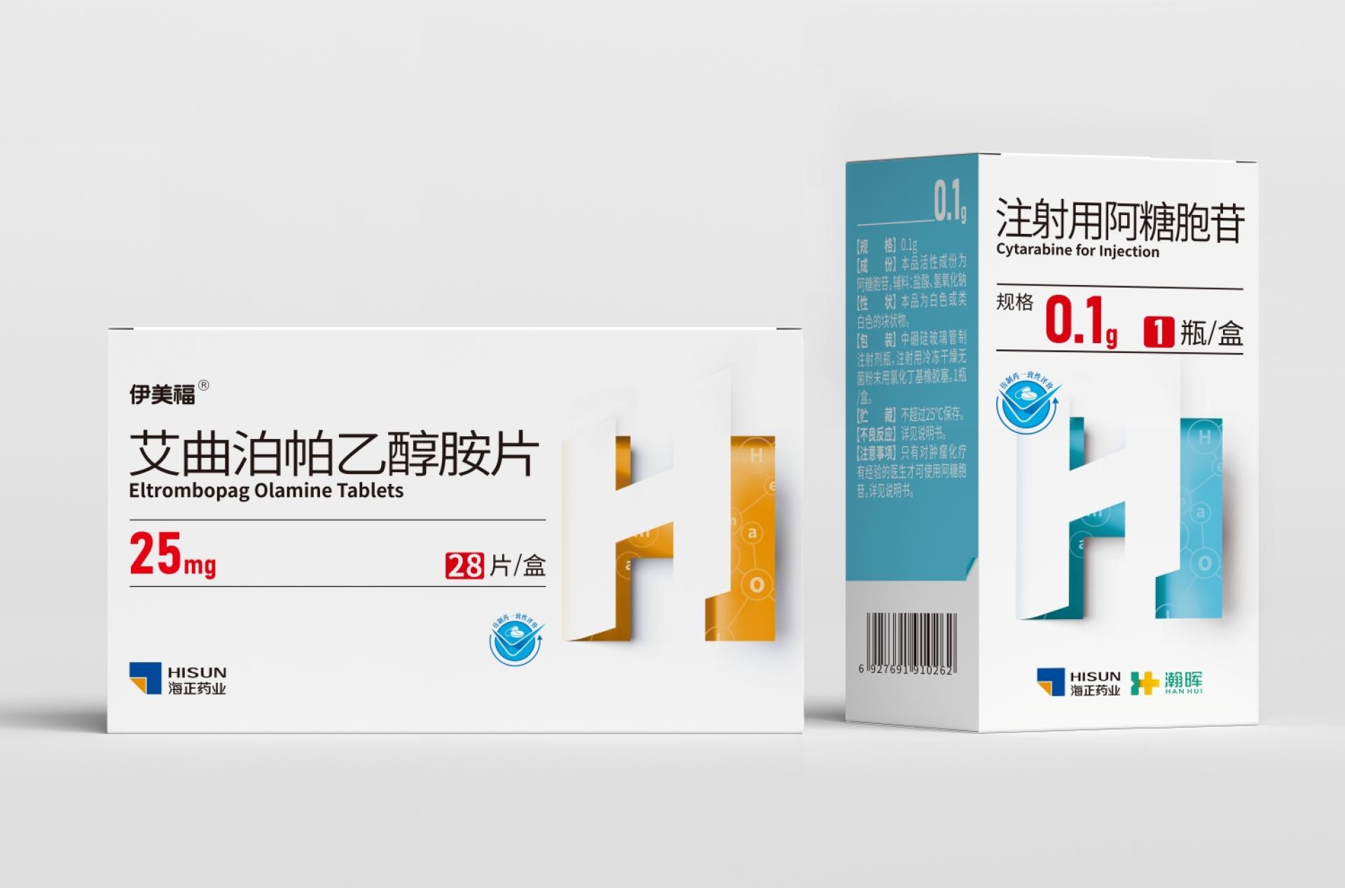
Project Background: The original packaging of Zhejiang Hisun Pharmaceutical's products varied greatly, lacking an overall brand recognition. The client's main goal was to showcase the unique attributes of each product while maintaining a unified brand image.
Design Strategy and Implementation:
1. Symbol Level — Brand DNA and Innovation Vision
We used the English initials of each therapeutic area as differentiating symbols, turning them into graphic elements and integrating them with the visual metaphor of an "opening door." This not only reflects the company's determination to continuously break technical barriers and enter a new stage of internationalization but also cleverly echoes the concept in Hisun's logo of "the start of a grand undertaking," turning the packaging into a visual carrier of the brand spirit.
2. Color Level — Rational Distinction and Emotional Care
To avoid confusion when multiple product categories are placed together, each product has its own distinct color. The color system strictly follows pharmacological properties and considers patients’ emotional needs during use. We also carefully researched domestic and international pharmaceutical color practices and restrictions to ensure the design is safe and universally applicable in global markets.
3. Layout Level — Unified Framework and Aesthetic Order
All packaging follows a consistent layout structure, establishing standards for text hierarchy, graphic placement, and whitespace ratios. This creates a clear, trustworthy family visual sequence and strengthens recognition across product displays.
4. Information Level — Safety First, Convenience Always
Based on patients' actual usage experience, key medication information such as indications, dosage, and contraindications are highlighted separately, ensuring the information is easy to understand and minimizing the risk of misuse. The design truly prioritizes health and safety.
Overall Value: This design achieves a balance between brand unity and product individuality through the coordinated innovation of symbols, colors, layouts, and information. It helps Hisun Pharmaceutical present a more professional, internationalized image in the market.




Credits
Entrant
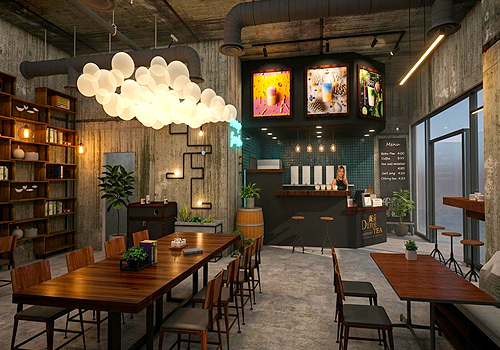
Oakdale Design Studio LLC
Category
Interior Design - Restaurants & Café
Entrant
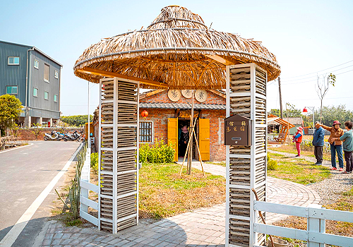
雲林縣政府 Yunlin County Government
Category
Landscape Design - Landscape Renovation
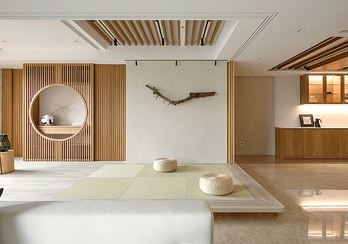
Entrant
ArtGet Interior Decoration Design Co., Ltd.
Category
Interior Design - Living Spaces
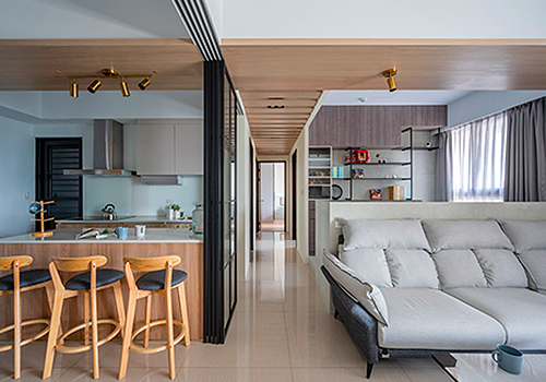
Entrant
Hong Xin Interior Design & Decoration
Category
Interior Design - Residential