2026 | Professional

KINTAIWU YITIAOGEN Relaxing Set
Entrant
KINTAIWU Biotechnology Co., Ltd.
Category
Packaging Design - Medicinal & Herbal Products
Client's Name
Country / Region
Taiwan
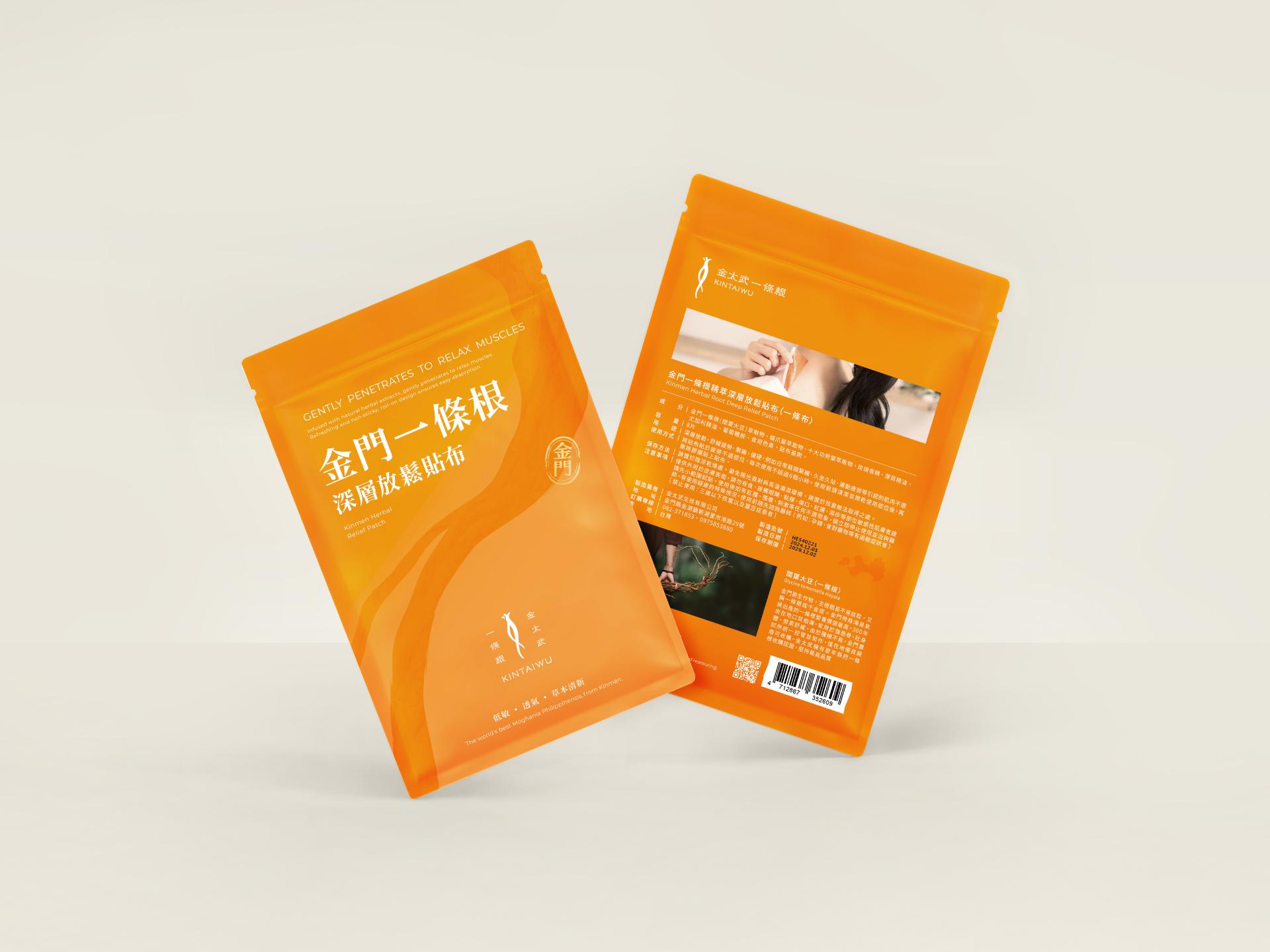
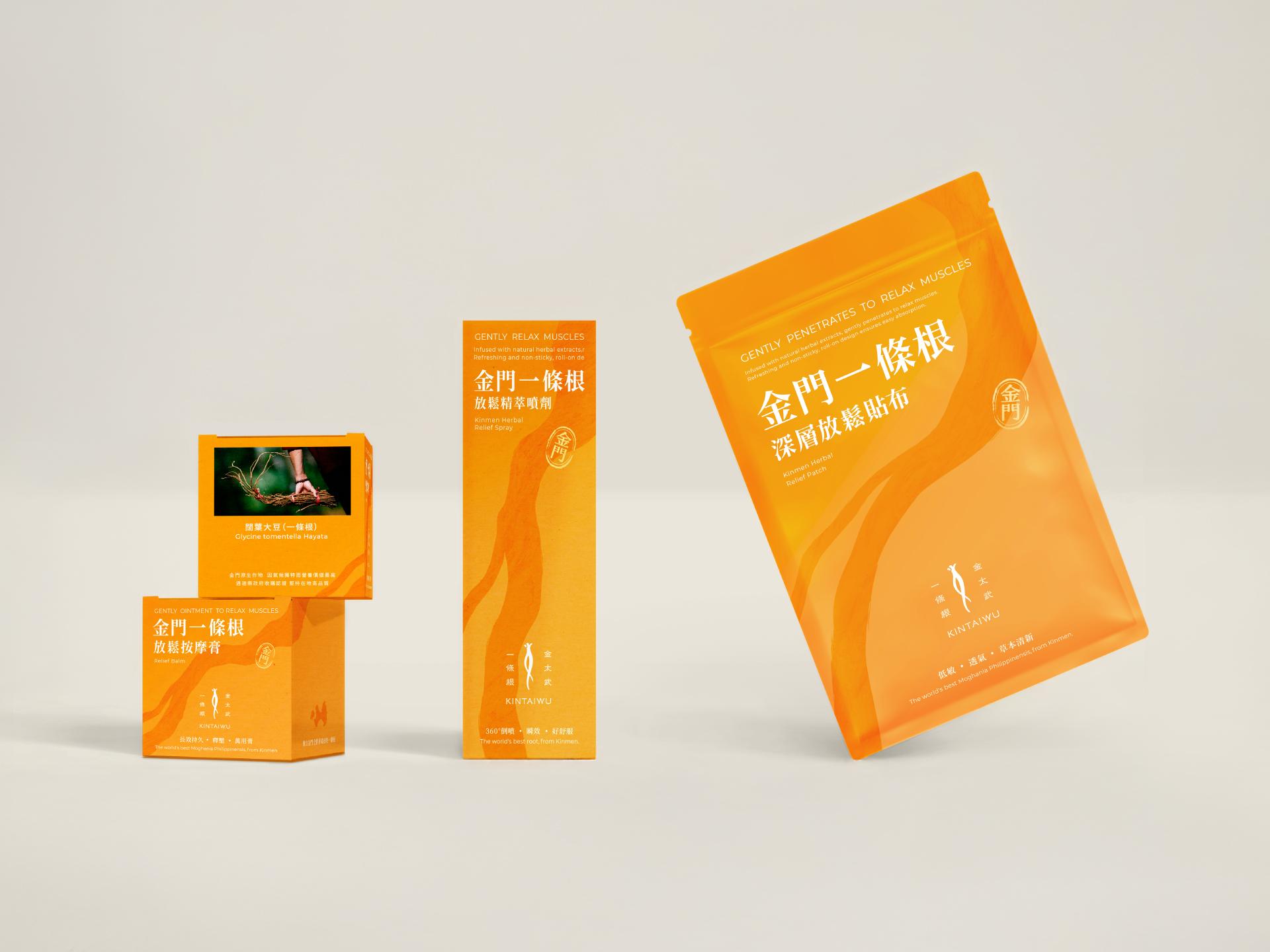
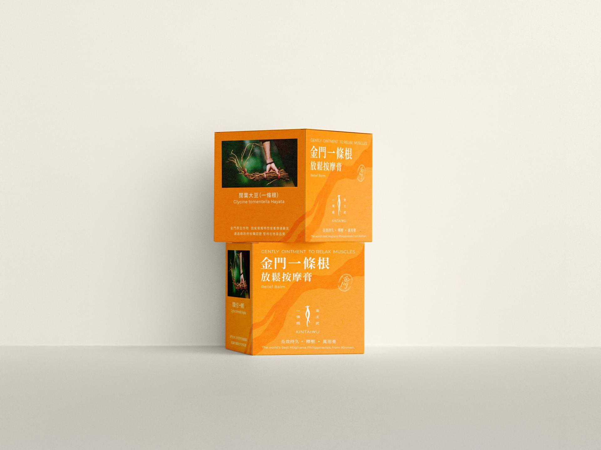
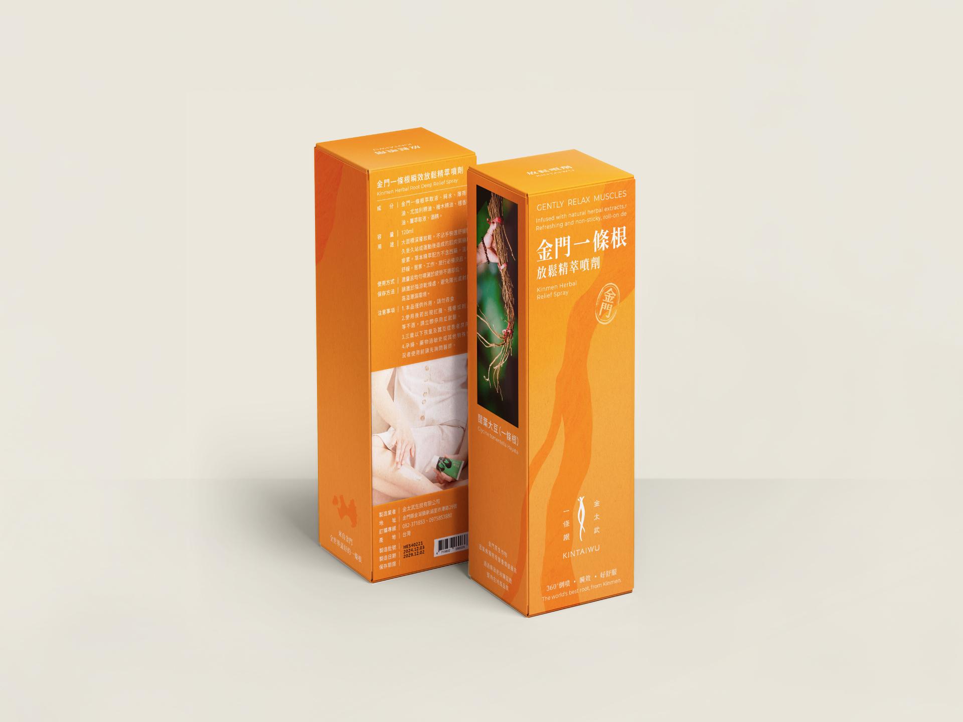
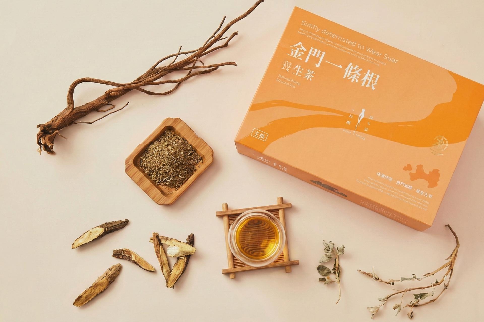
The “KINTAIWUYitiaogen” packaging is built around the idea of “relaxing power grown from Kinmen’s land,” combining a century-old local herb with modern biotech in a clear, consistent visual system. The logo takes the slender shape of the Yitiaogen root and merges it with a stretching human silhouette, symbolizing the change from pain to relief.
A warm, soft orange is used as the main color across the range, paired with flowing root graphics that replace the traditional red-and-green look. This makes the products feel both professional and trustworthy, while also creating a more comfortable, everyday self-care atmosphere. Different formats—relief cream, patch, spray, roll-on, and wellness tea—extend from the same visual language, with layout, imagery, and information hierarchy adjusted to create a strong, easy-to-recognize KINTAIWU look.
On-pack information also highlights that the herbs are truly grown in Kinmen under an official contract-farming system, allowing consumers to see the origin and the people behind the product and to build trust with the brand and the region. Using a modern design language to reinterpret a traditional herb, the packaging turns body relaxation into a natural, aesthetically pleasing part of daily life.
Credits

Entrant
Haoran Yuan
Category
Architectural Design - Conceptual Design
Entrant
Jinhua Yukai Technology Co., Ltd
Category
Product Design - Bakeware, Tableware, Drinkware & Cookware
Entrant
University of Washington
Category
User Experience (UX) Design - Best Use of AI & Machine Learning
Entrant
CHIA HSING V.Glorious
Category
Interior Design - Home Décor