2025 | Professional

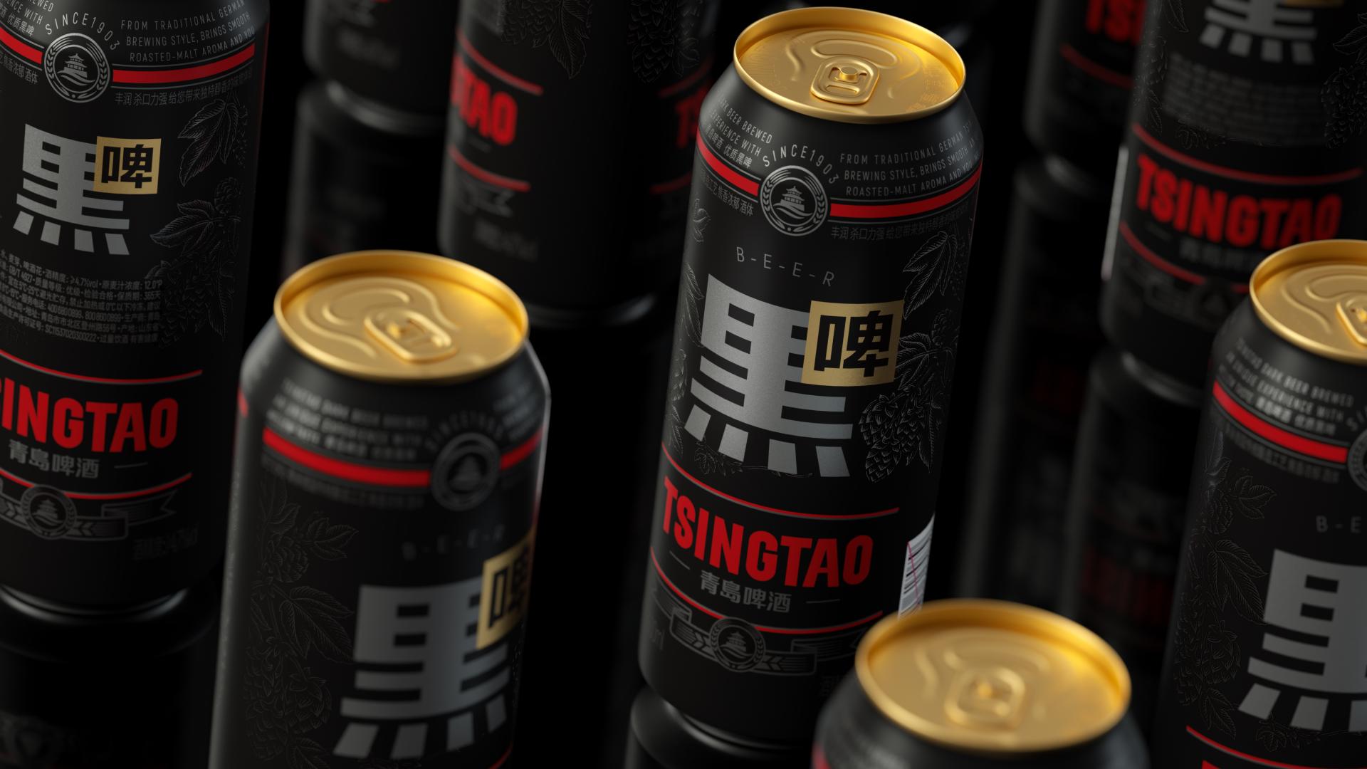
Tsingtao Stout Beer
Entrant
Shenzhen Tigerpan Design Co., Ltd
Category
Packaging Design - Wine, Beer & Liquor
Client's Name
Tsingtao Beer Co., Ltd.
Country / Region
China
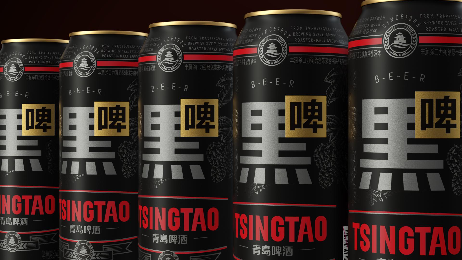
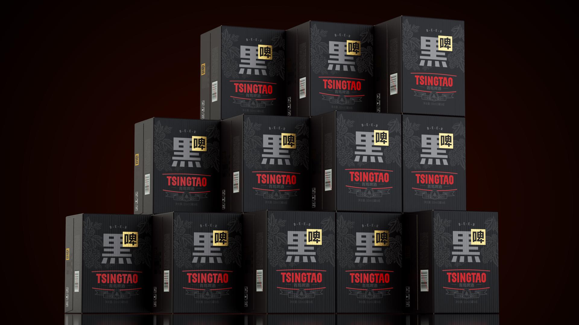
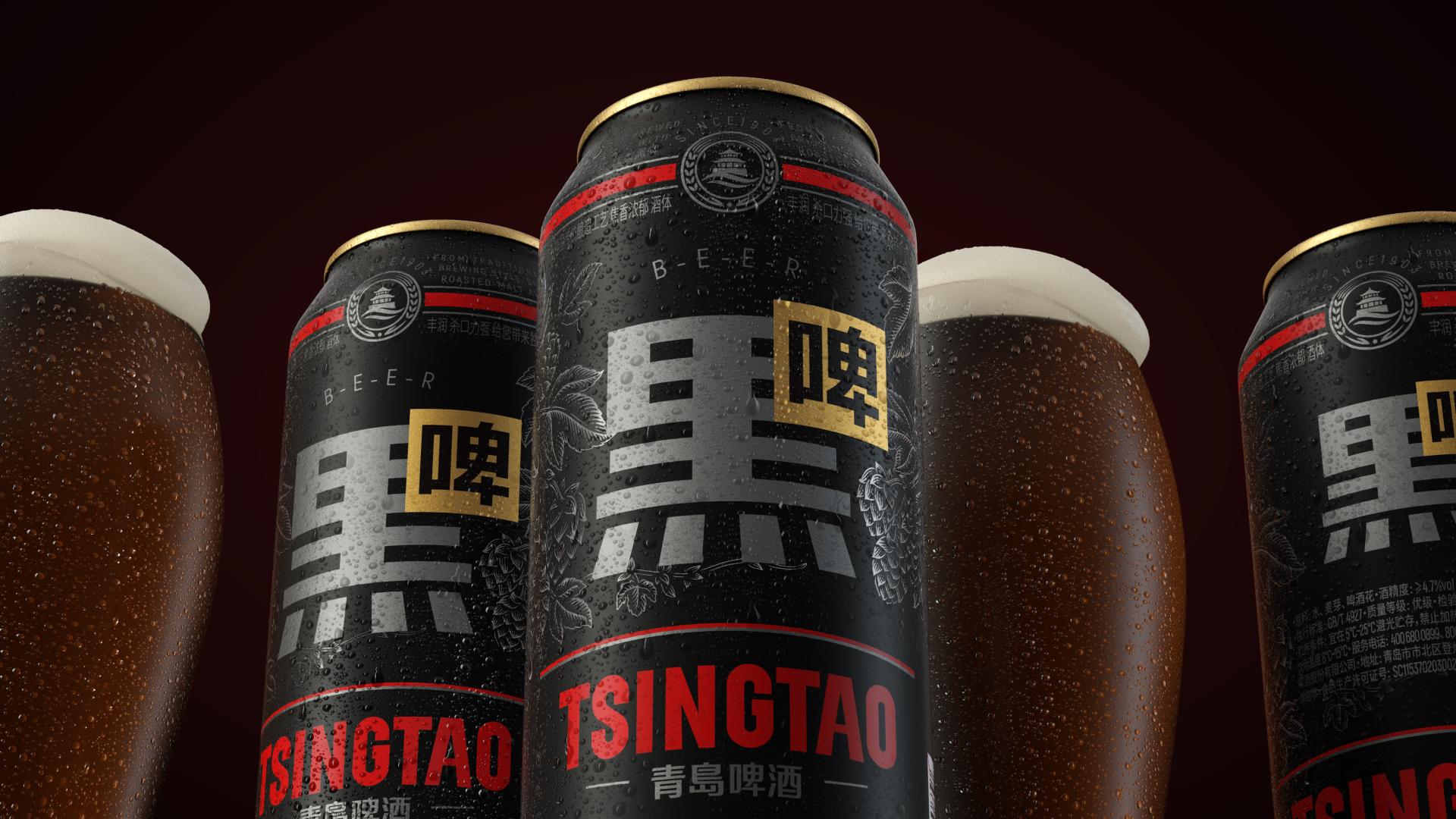
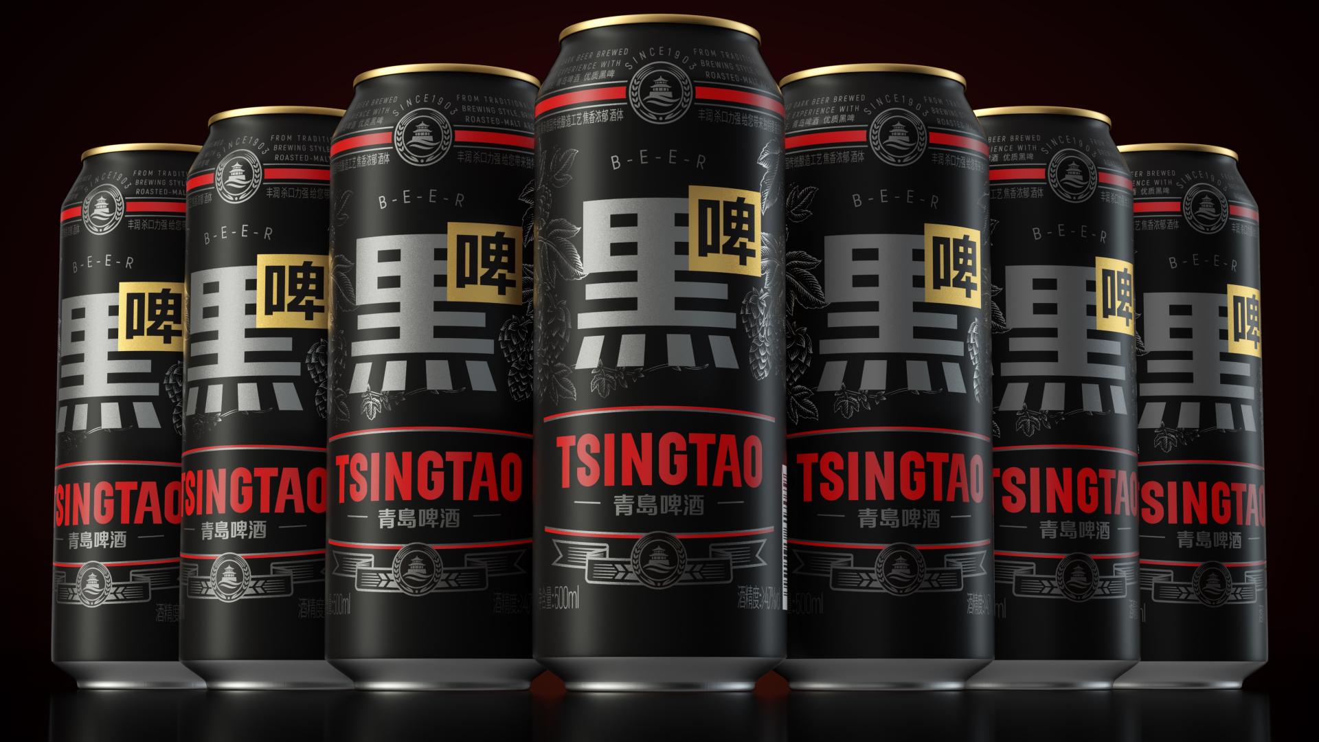
In the niche market of Chinese stout, our design aims to establish a unique visual identity by utilizing a flat design language to artistically represent Chinese characters. The bold use of silver combined with fashionable black and red creates an elegant yet striking packaging that redefines stout in the Chinese market. The core idea is to introduce a distinctly Chinese representation of stout, moving away from the English-dominated market. By integrating Chinese characters into the design, we aim to make the product more relatable and appealing to local consumers, positioning it as a cultural icon.
Credits
Entrant
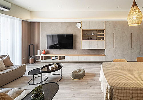
HUA-YANG Interior Decoration Design
Category
Interior Design - Residential
Entrant
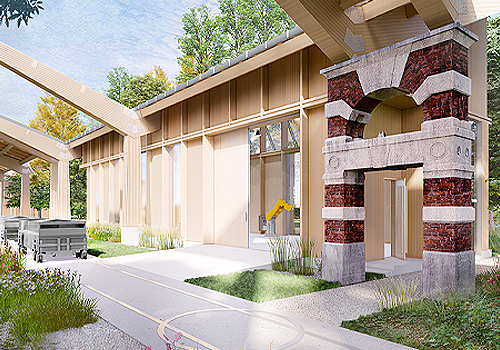
Xueyuan Wang, Justin Fan
Category
Architectural Design - Factory / Warehouse

Entrant
Zhejiang Jinchan Curtain Co.,Ltd
Category
Product Design - Textiles / Floor Coverings

Entrant
Beijing Huayu Culture Co., Ltd.
Category
Product Design - Bakeware, Tableware, Drinkware & Cookware