2024 | Professional

VEGEHERO green juice
Entrant
Zhejiang Tieding Yoyo Biotechnology Co., Ltd.
Category
Packaging Design - Non-Alcoholic Beverages
Client's Name
Country / Region
China
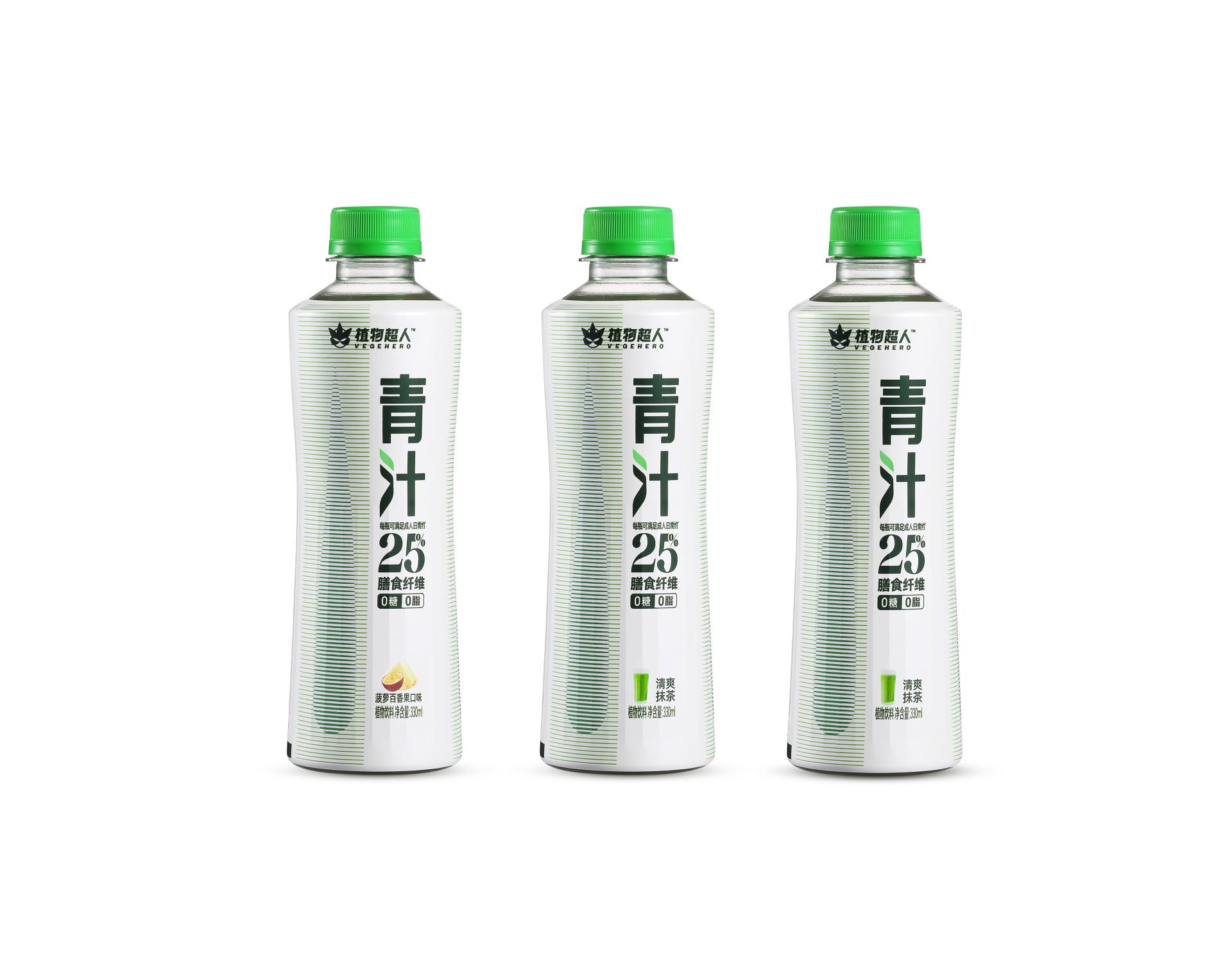
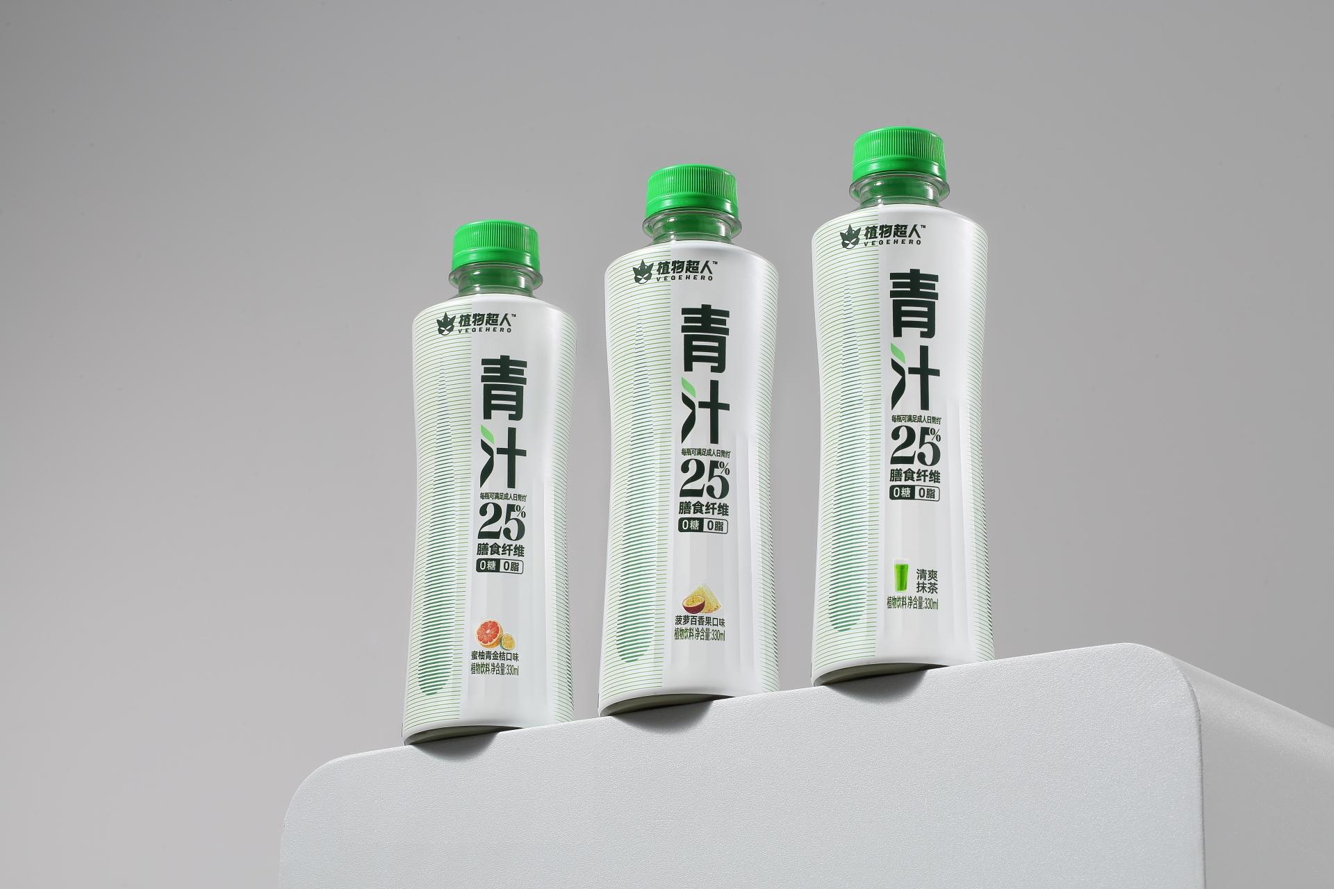
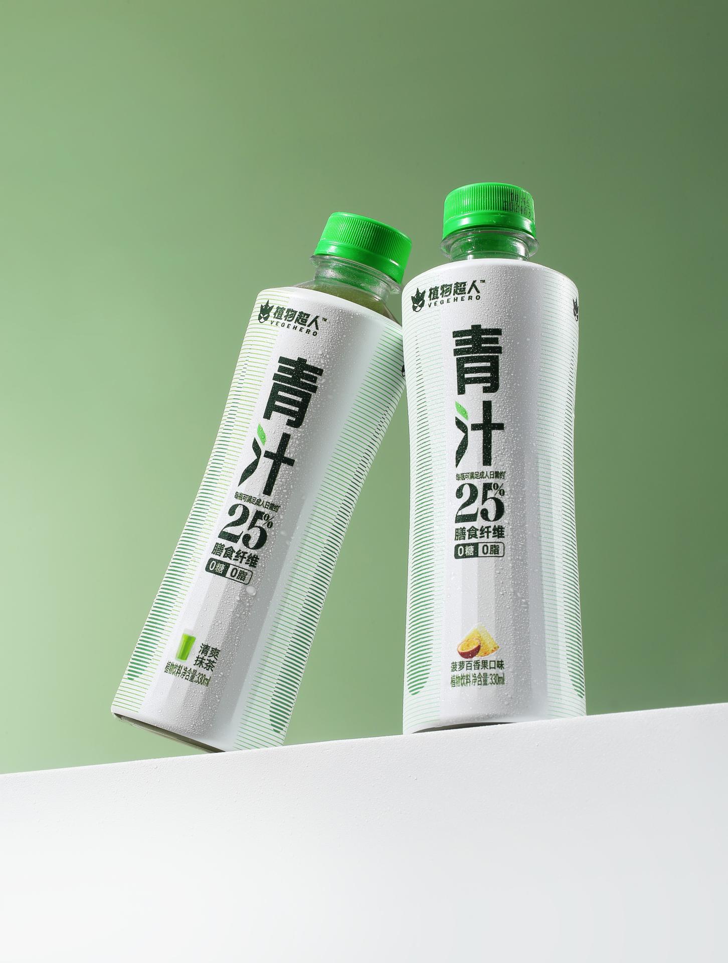
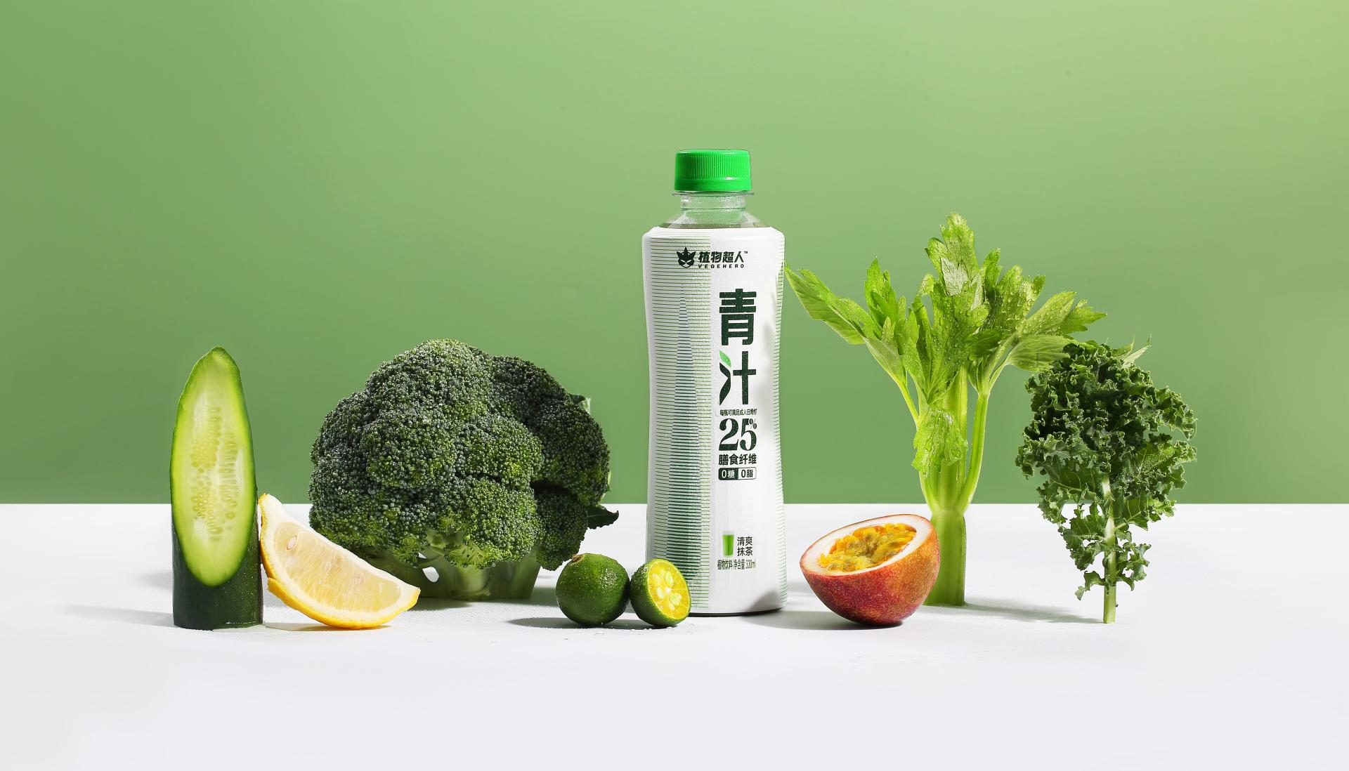
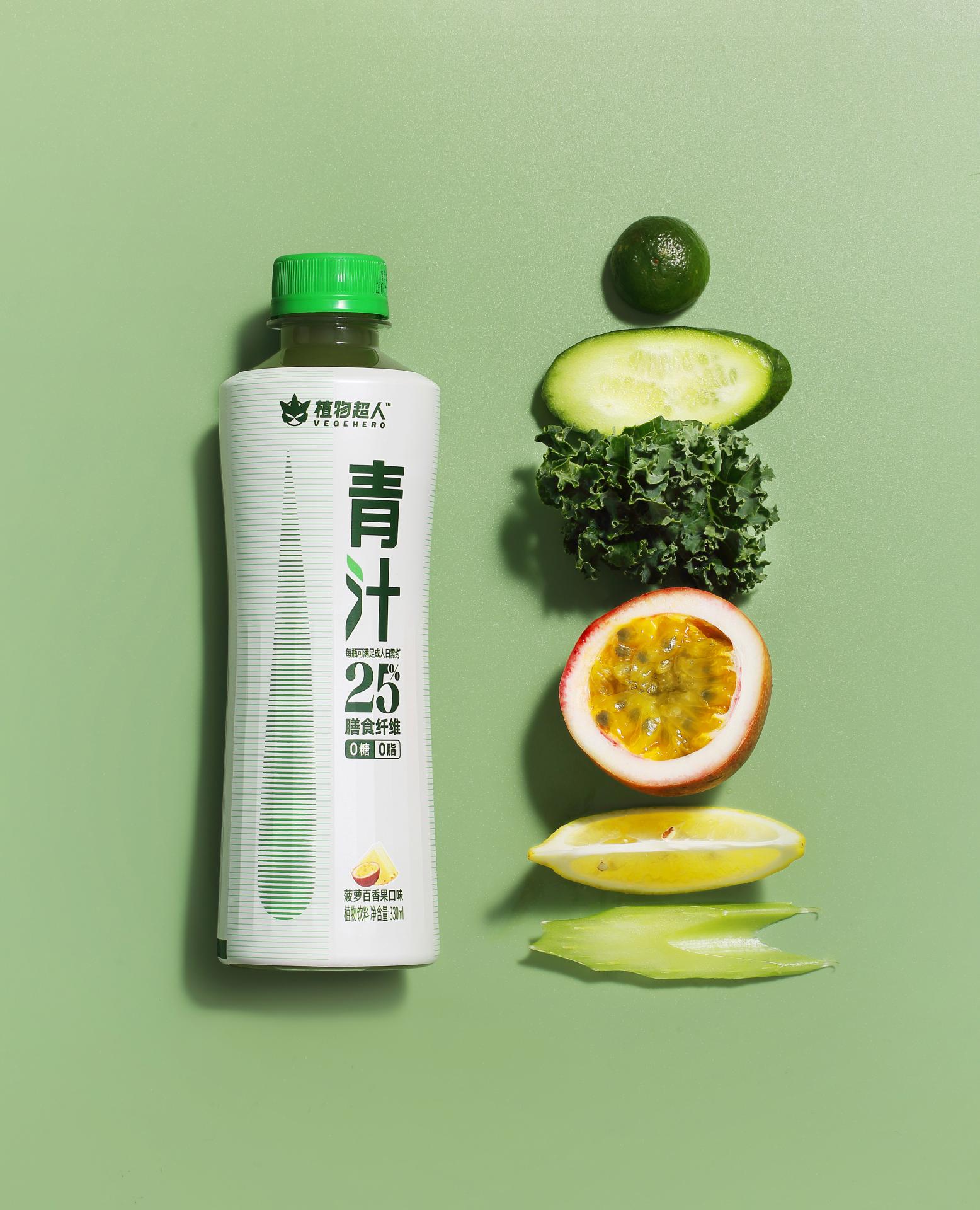
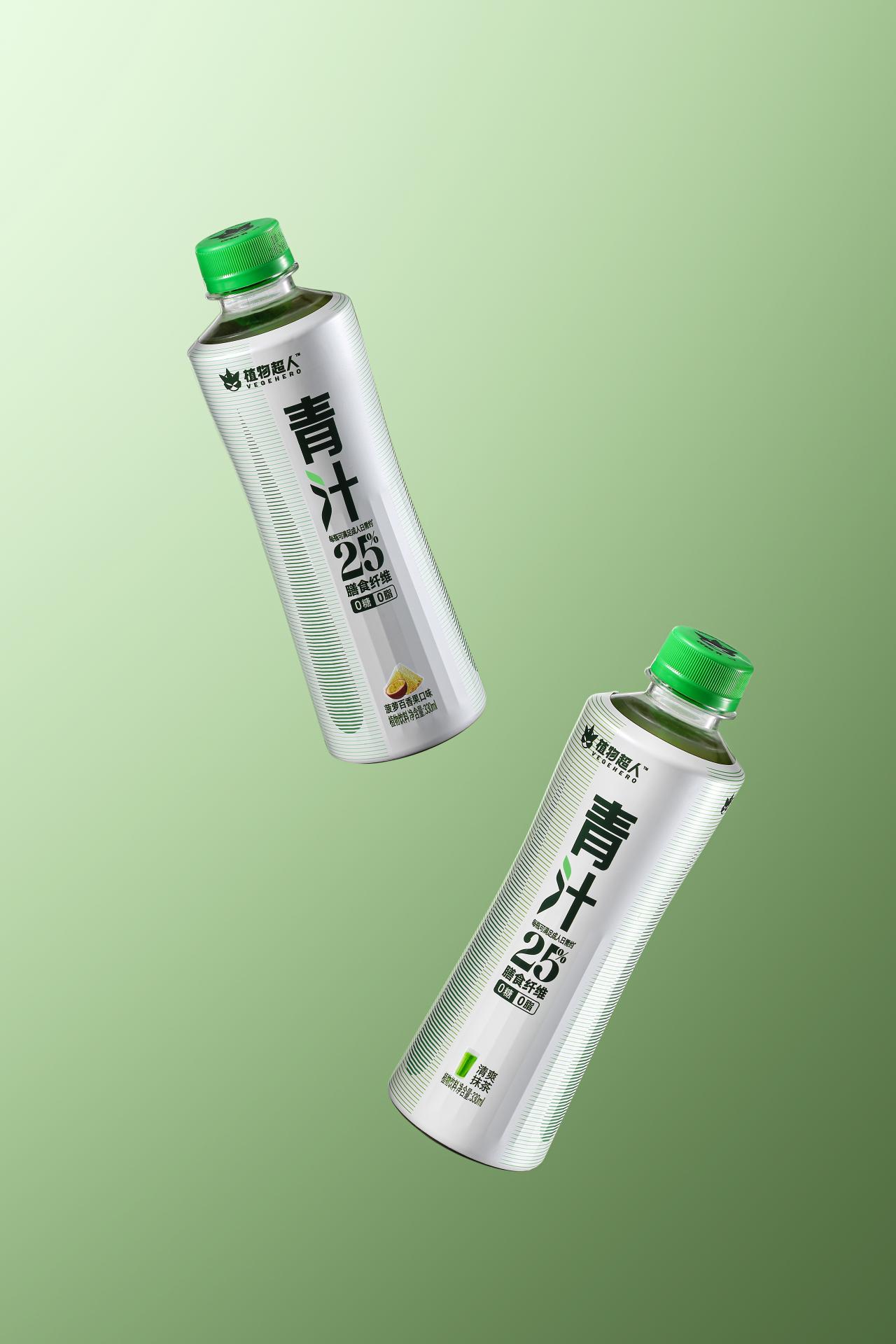
The VEGEHERO has introduced new packaging for its plant-based drink. This packaging aims to promote dietary fibre intake, recognised as the seventh most essential nutrient for human health. The design emphasises the inherent purity of the product's natural ingredients and its beneficial functional properties, achieved through a minimalist bottle design, strategic line combinations, innovative font choices, and other design elements.
The design is inspired by the energy of the drink's natural plant ingredients. The primary visual elements on the bottle consist of green gradient lines. The light horizontal lines symbolise dietary fibre, underscoring the health advantages of the drink. Conversely, the dark horizontal lines construct water drops, which indicate the product's attribute of soft beverage, and also serve as an abstract representation of young barley leaves, highlighting the natural and healthful qualities of the product with a modern aesthetic. The design team ingeniously incorporated the leaf form into the font design by extracting and artistically reshaping the drink's raw material, young barley leaves. This intuitive integration effectively establishes a visual link between the product and its natural plant origins, allowing users to perceive nature's inherent power and pristine beauty with each visual interaction.
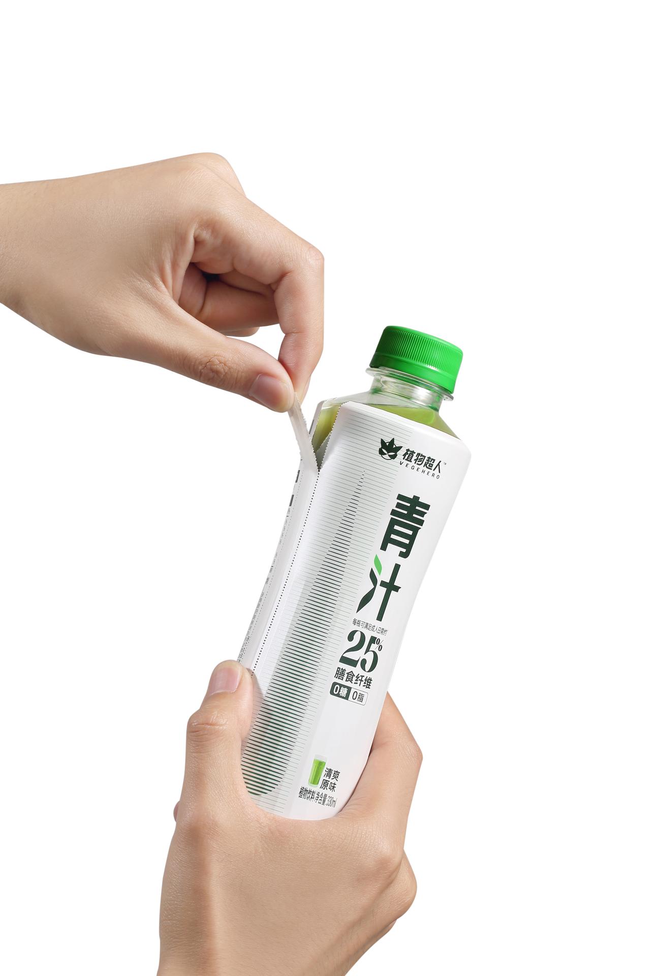
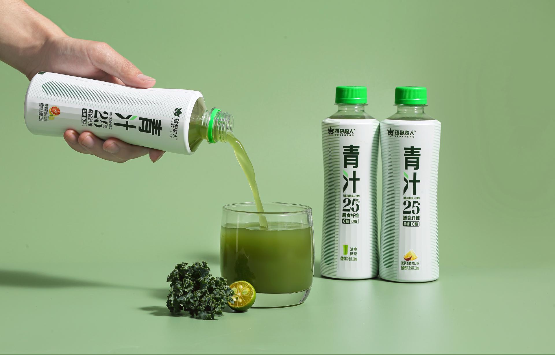
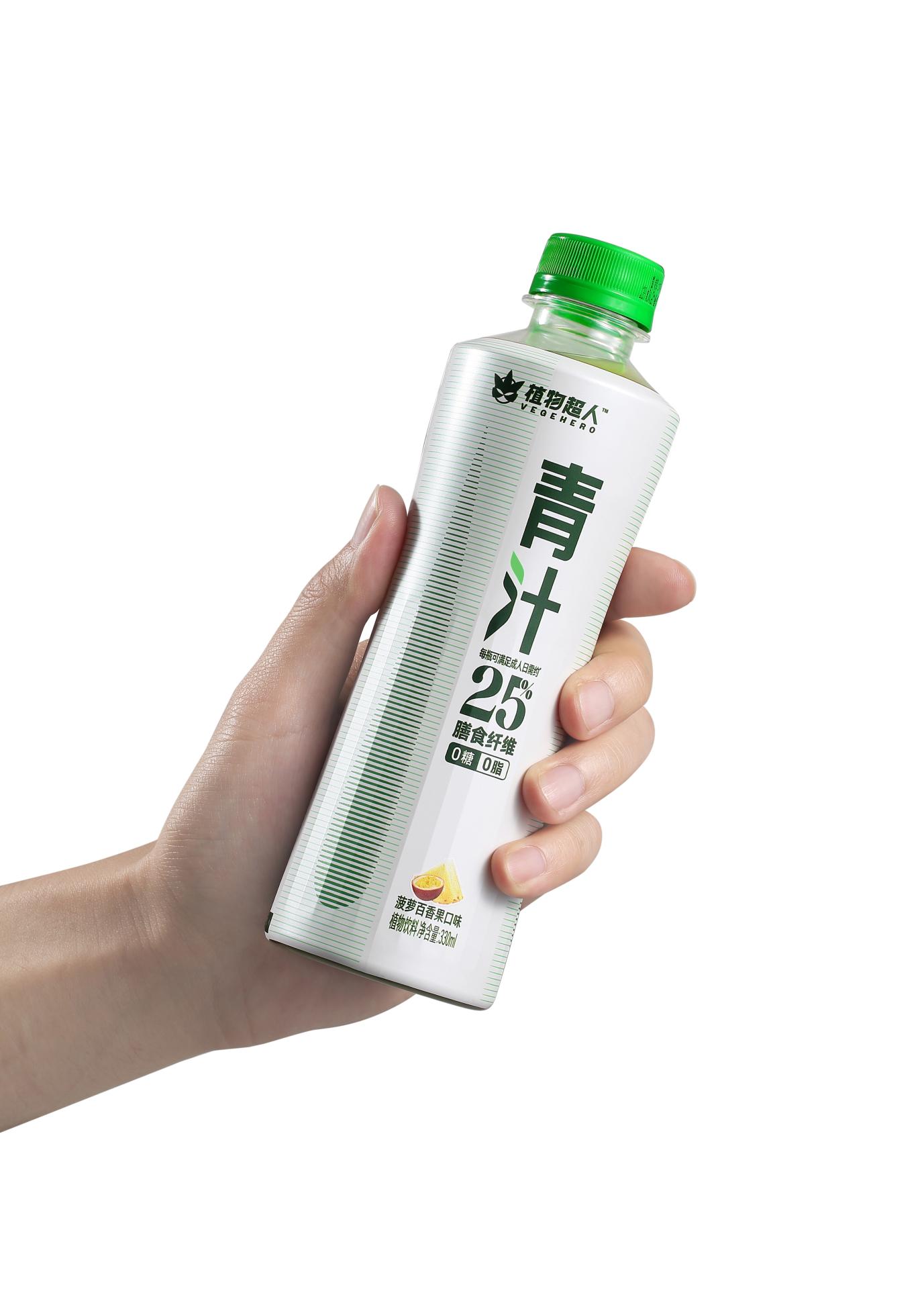
The slender middle part of the bottle is specifically crafted to mimic the contours of a healthy physique, effectively illustrating the advantages of dietary fibre in supporting gastrointestinal health and enhancing a pleasing form. Furthermore, the bottle design has been subjected to extensive scientific testing and user feedback, ensuring that it conforms to the natural curvature of the human hand. This design feature makes it suitable for one-handed use for individuals across diverse demographic groups, thus enhancing its user-friendliness. The minimalistic digital message on the bottle underscores the product's health benefits by drawing attention to the fact that it provides approximately 25% of the recommended daily dietary fibre intake for adults. The packaging features an easy-tear line to facilitate disassembly and recycling. Additionally, the brand's environmental initiative encourages recycling empty bottles in exchange for green plants. This not only promotes sustainable practices but also fosters a deeper emotional connection with consumers.
Entrant
Amandine Mondion
Category
Product Design - Digital & Electronic Devices
Entrant
Guangzhou Factory 18 Innovation & Technology Co., Ltd
Category
Product Design - Office Equipment
Entrant
Pu-Shin Beauty Co., Ltd.
Category
Product Design - Healthcare
Entrant
XY設計
Category
Interior Design - Residential